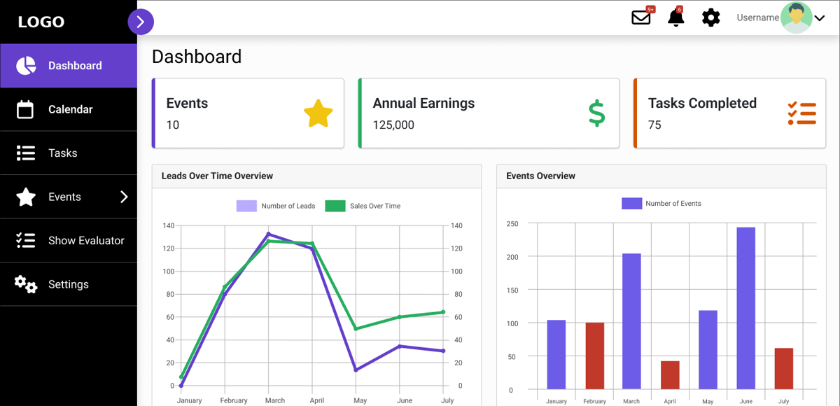
Tradeshow Management Platform
Client details anonymized | Product Design, Design System, Prototyping
The Problem
An exhibitor who runs trade shows was managing everything (budgets, travel, booth materials, tasks and show strategy) in Excel spreadsheets. Information was scattered, hard to keep current and hard to share with the team. The stakeholder wanted a single platform similar to existing tradeshow tools, with changes that fit their own workflow.
My Role & Responsibilities
Part-time project during my Master's in Human-Computer Interaction Design, through Harrisburg University's Center for Innovation and Entrepreneurship. I worked as one of two designers and covered:
- Color system and design tokens
- Reusable components and states
- Wireframes and high-fidelity product pages
- The clickable Figma prototype, including AI-assisted features
Process
We benchmarked existing tradeshow tools with the client, sketched grayscale wireframes of the core flows, built the design system, then moved to high-fidelity screens and a connected prototype. We reviewed the work with a professor and the client, and I completed the client's final comments in September 2025.
The Flow
Key Design Decisions
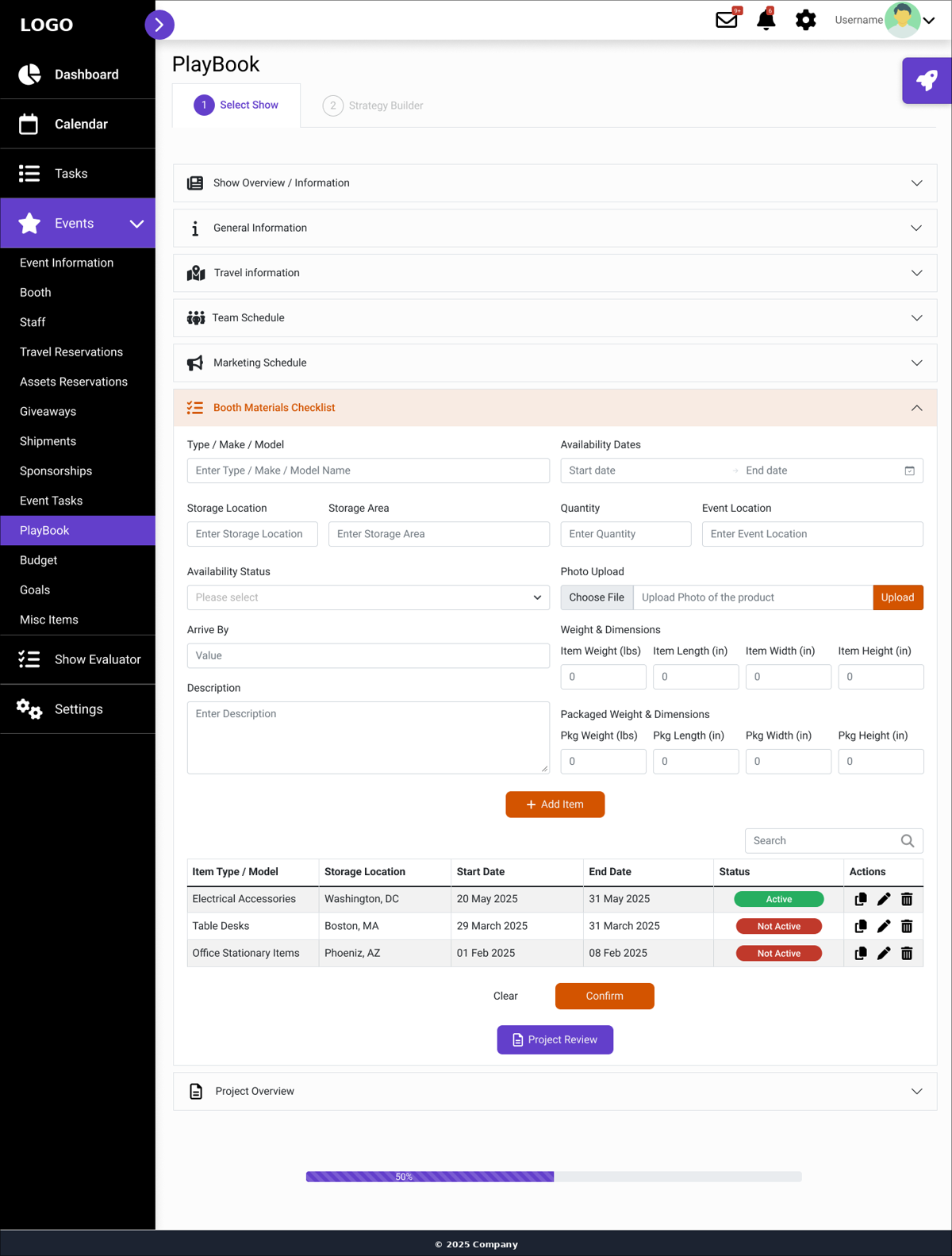
- Meet the stakeholder where they were. Shows and budgets can be uploaded from the client's own Excel files, with a template provided, so the move off spreadsheets starts without retyping.
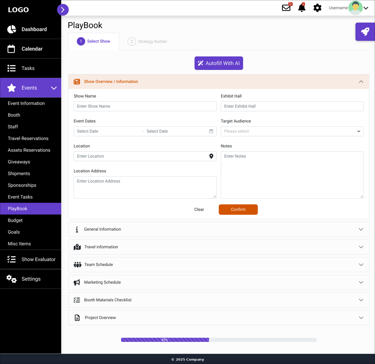
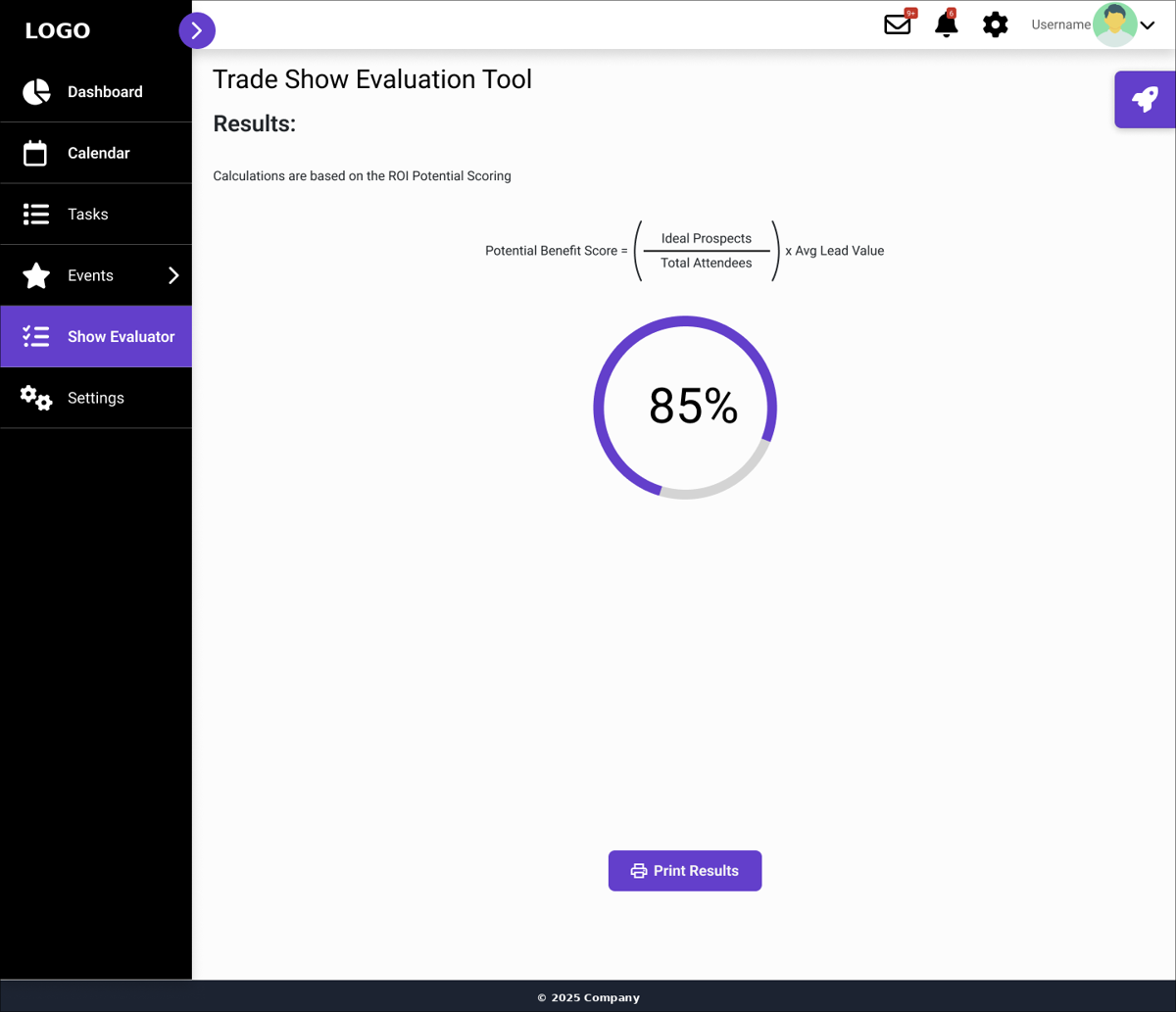
- Make a long task feel short. The PlayBook is split into accordion sections with a progress bar, and each section saves on its own.
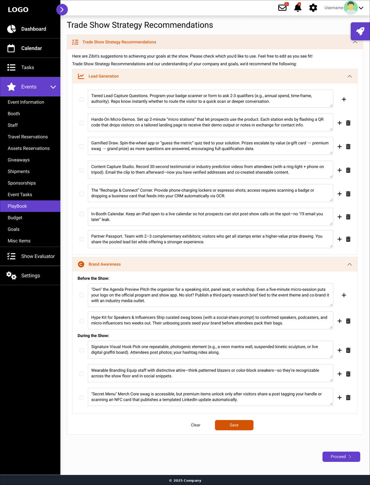
- AI that stays editable. "Autofill with AI" and strategy recommendations are suggestions the user checks, edits or removes.
- Consistent patterns. Every table row has the same add, duplicate and delete actions, and status uses the same pill style everywhere.
- Guidance in context. A side panel with short tips appears where the user is working, so they don't leave the page.
Design System
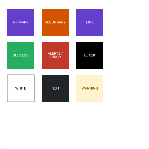
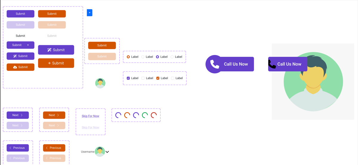
Nine color roles carry the whole interface: a deep primary (#633FCB) for navigation and primary actions, and a secondary (#D35400) that signals action. Semantic colors cover success (#27AE60), error (#C0392B) and warning (#FFF3CD with #6C5200 text). Components include buttons with default, hover and disabled states, form controls, modals, cards and loaders.
Accessibility Check & What I'd Fix Next
I checked text contrast against WCAG 2.1 AA (4.5:1 for normal text):
- Passes: white on primary 6.8:1, white on error 5.4:1, body text on white 15.4:1, warning text on its background 6.7:1.
- Falls short: white on the secondary orange is 4.2:1, white on the success green is 2.9:1, and orange text on the peach accordion header is 3.5:1.
- Next iteration: darken the orange to about #BF4A00 (5.0:1) and the green to about #1E8449 (4.7:1). I would also reserve red for errors only, since it currently also marks due dates and waiting statuses.
Outcome & Learnings
The project was delivered in September 2025 after the client's final comments were addressed. The biggest lesson was designing for a user's existing habits: the Excel import mattered more to adoption than any single screen. It also showed me how much a small token set and shared patterns speed up designing a large product with two people.