iMovies Theatre App
High-Fidelity Mobile Prototype | UX/UI Design, Interaction Design, Prototyping
The Problem
Movie ticket booking apps often have cluttered interfaces and confusing seat selection. Users struggle with finding showtimes and completing reservations quickly, leading to frustration and abandoned bookings.
My Role & Responsibilities
- UX/UI Designer
- Interaction Designer
- Prototyper
Led end-to-end design from research to interactive prototype, creating wireframes, visual designs, and user testing.
Design Process
User Research & Insights
- Conducted competitive analysis of Fandango, AMC, and other booking apps
- Identified key pain points: confusing navigation and poor seat visualization
- User goal: Quick, intuitive booking experience under 2 minutes
Wireframes & Early Concepts
Early explorations focused on simplifying the booking flow and creating an intuitive seat selection interface. I iterated through multiple wireframe versions to optimize the user journey.
Visual Design System
Established a cohesive design system focused on accessibility and intuitive interactions. The interface employs a clean, minimalist aesthetic to reduce cognitive load while maintaining visual interest through thoughtful typography and consistent spacing.
Key Design Decisions:
- Clean, minimalist interface to reduce cognitive load
- Intuitive seat selection with clear visual feedback
- Clear typography hierarchy for better readability
- Consistent color scheme across all screens
- Accessible contrast ratios meeting WCAG standards
- Responsive grid system for cross-device consistency
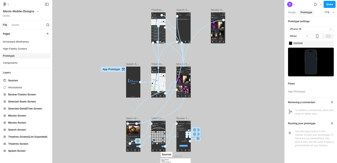
Interactive Prototype
Experience the full booking flow with this interactive Figma prototype:
Key Interactions:
- Smooth transitions between screens
- Realistic seat selection with visual feedback
- Clear booking progress indicator
- Intuitive gesture-based navigation
Accessibility Considerations
- High color contrast ratios for better readability
- Large touch targets (minimum 44x44px) for easy interaction
- Clear typography hierarchy with proper heading structure
- Color-blind friendly palette with alternative indicators
Tools Used
- Figma - Prototyping & Design
- Adobe Illustrator - Icon Design
- User Research & Competitive Analysis
Lessons Learned
This project taught me the importance of early user testing in the design process. I discovered that simplifying complex flows like seat selection requires multiple iterations, but ultimately results in a much more intuitive user experience. Balancing aesthetic appeal with functional clarity was key to creating a successful booking interface.